Usability Testing for Improved Design and Information Architecture
Our journey in usability testing led to key refinements in design and information structuring. By exploring wireframes and employing card sorting, we pinpointed user hurdles and transformed them into intuitive navigation and clear tasks. The result? A garden planning app that's as seamless as it is engaging, with an AR experience that's totally user-friendly.
Output
Prototype for mobile App
Activities
UI Design, Usability Testing, Motion Design
Subject Matter
Student work in team with other students
Idea
Our aim with this app was twofold: to make useful information about plants easily accessible and to provide users with a representation of their garden in both map and AR formats.
Wireframes and Prototypes

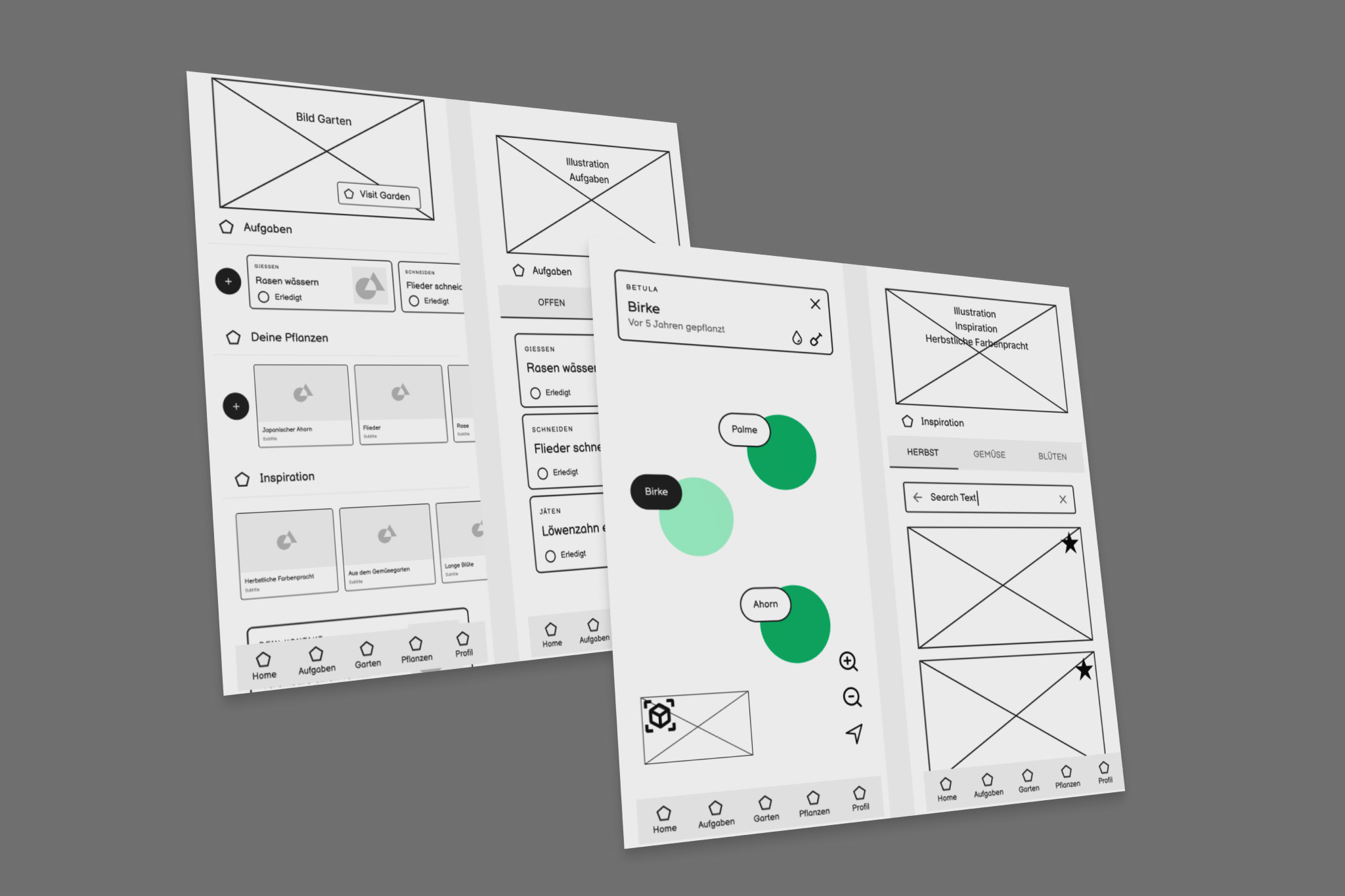
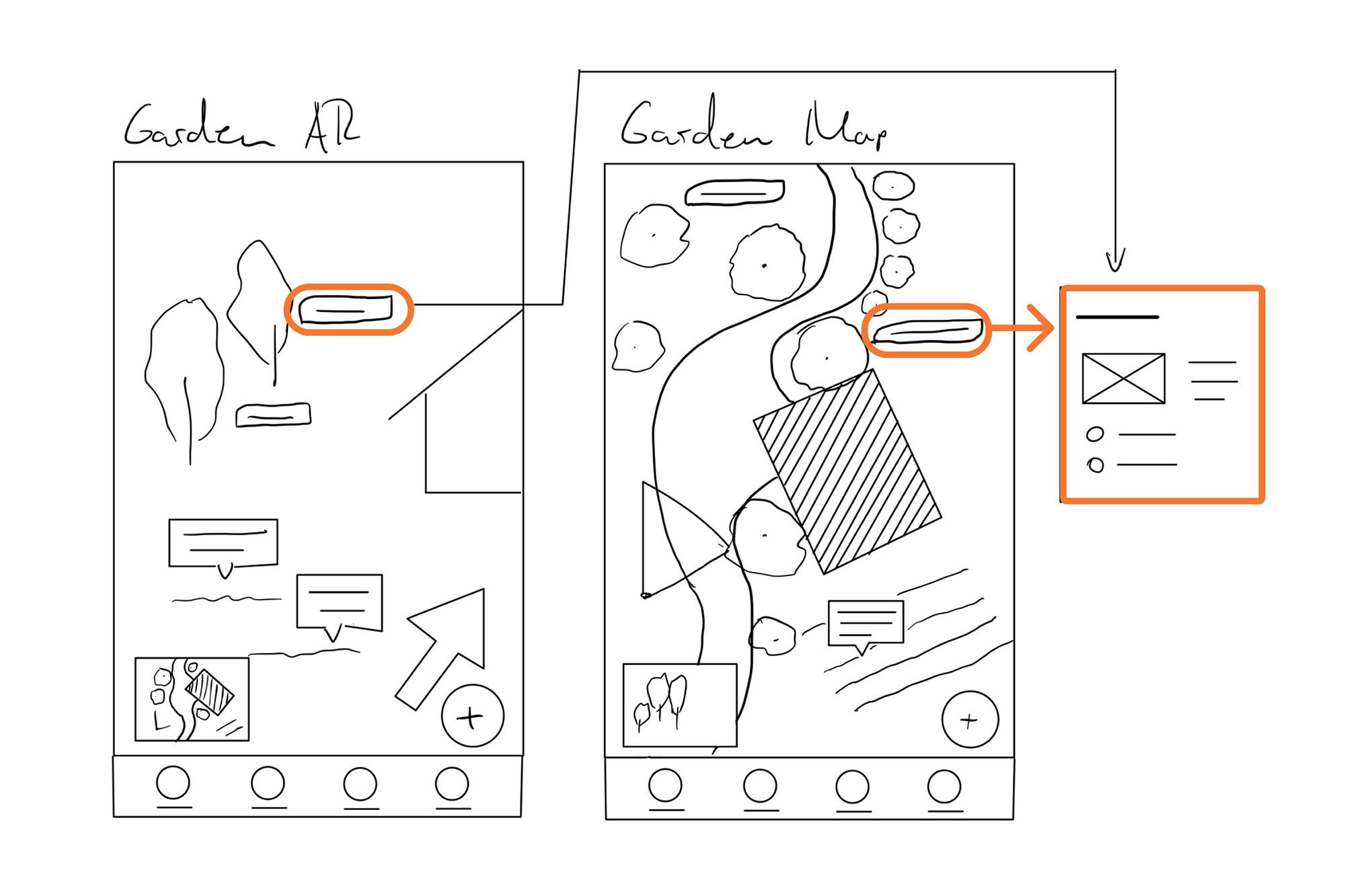
Starting with this foundational idea, our design process began with initial scribbles using methods like 6-3-5 or Crazy 8, moving on to wireframes. We iterated the prototype to a basic level where the information architecture, user guidance, and content placeholders were distinctly recognizable. During the first stage of prototyping, we added features like assigning tasks to plants and have access to specific care information such as watering or fertilization. Additionally, the app allows direct purchasing of new plants.
Improving Usability

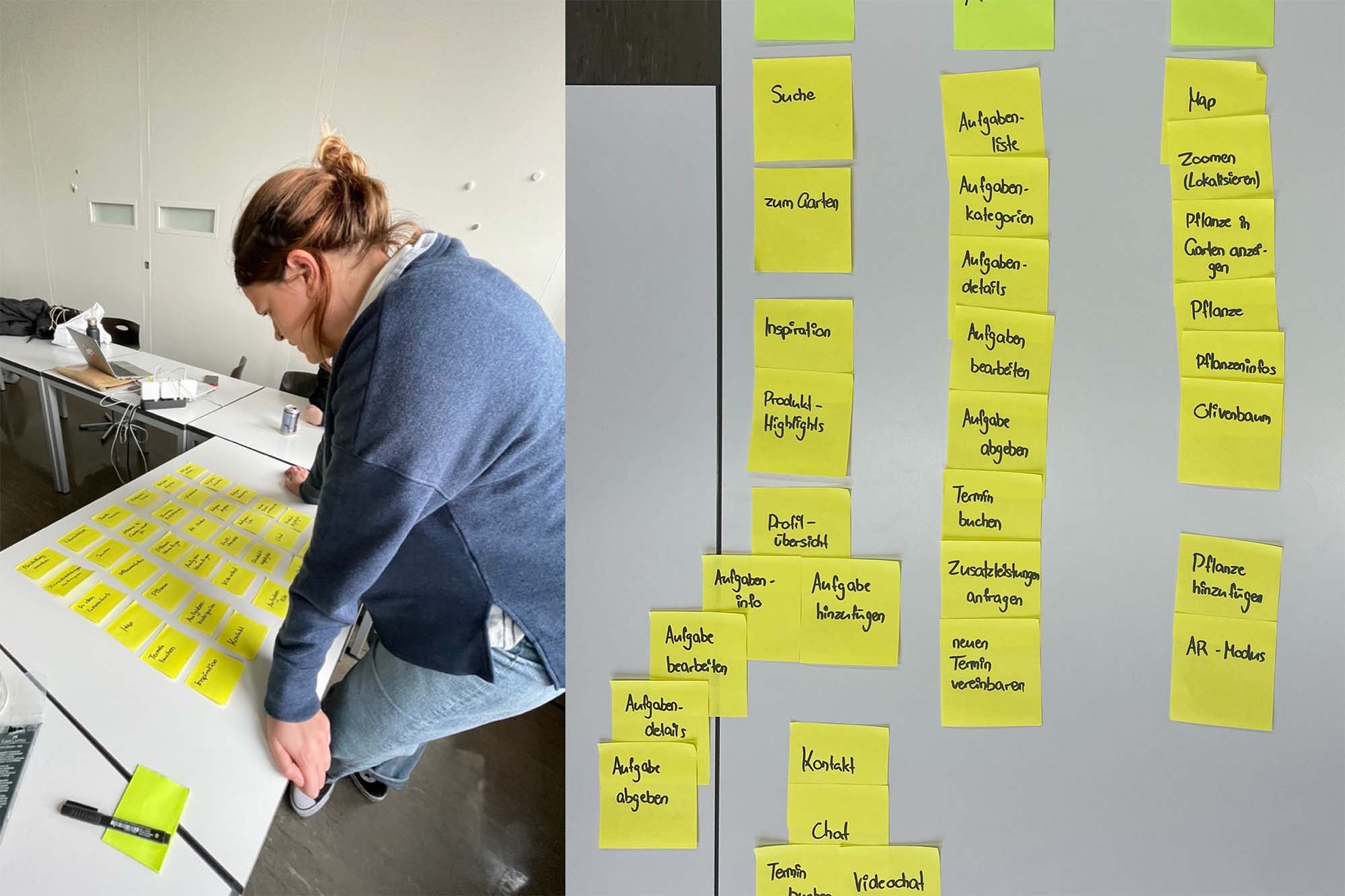
Our usability walkthrough and card sorting highlighted key challenges: ambiguous navigation, unclear gardener scheduling, and confusion in the shop's menu layout. Users sought more task details, intuitive indicators in AR, and a refined shop categorization. In response, we enhanced the navigation, introduced clearer task descriptions, adjusted AR cues, and revamped the shop layout for a streamlined user experience, aligning with best online UX practices.
Separate shop
to a new tab
AR integration in interactive prototype
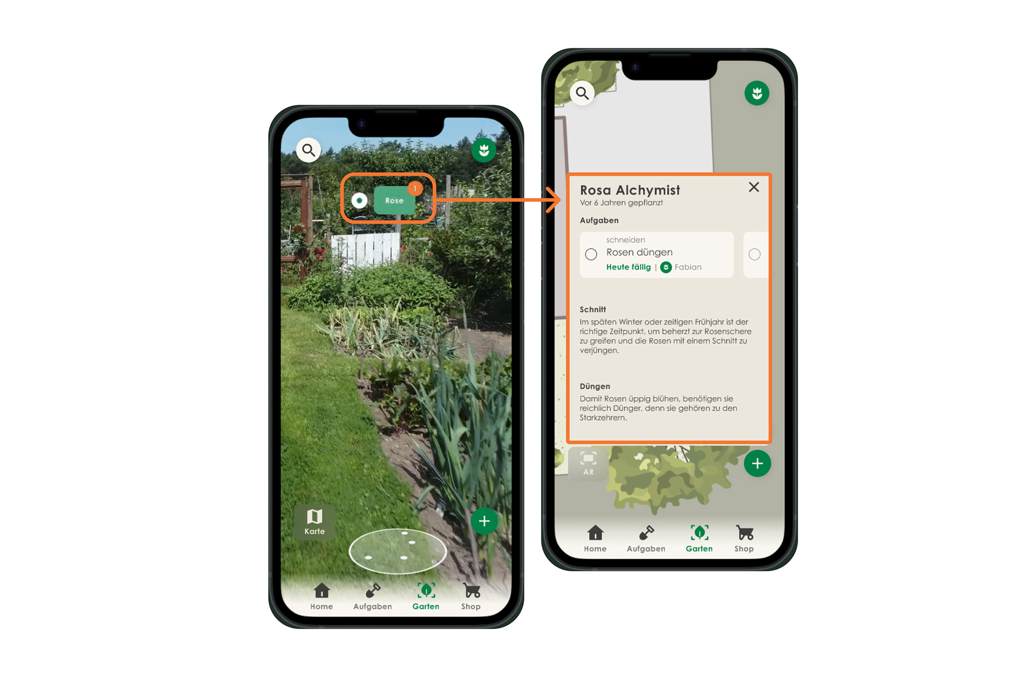
To ensure the AR view was both usable and interactive within the Figma prototype, I utilized Adobe After Effects with motion tracking to simulate a dynamic walk through the garden.
Plants appear based on the viewer's perspective and position. In the detailed view, tasks and valuable information about the plant species are displayed, making the Figma prototype fully interactive.

